
Color is a power that directly influences the soul
Wassily Kandinsky
Don’t you know color plays an incredible influence on our perception? It is even studied and called “Color Psychology” by scientists. Let’s learn about this concept with The Sunday Snug and how to apply it in choosing the right color palette for interior design.
What is Color Psychology?
In general, Color Psychology is a research showing the effects of different colors on variable psychological aspects of human: emotion, perception, productivity and creativity. You can observe this concept on usual day, such as people will tend to feel more energetic and motivated when they are surrounded by hot colors or they will feel relaxed in a cool colors environment.
Wanna know more about this concept? – Color Psychology
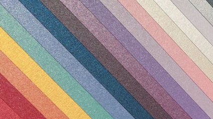
Colors and psychological effects on human perception
Below are the meanings as well as effects of popular colors on human psychology and perception:
- Red: happiness, love, passion, power, courage, willpower
- Orange: enthusiasm, creativity, energy, optimism, confidence
- Yellow: joy, happiness, energy, productivity, optimism, encourage, well-being
- Green: freshness, healing, harmony, comfortable, nature
- Blue: calmness, peace, softness, intelligence, trust, elegance
- Pink: love, romance, femininity, sweetness, warmth
- Purple: royalty, glamor, luxury, mystery, loyalty
- Brown: safety, warmth, comfortable, simplicity, trust
- Black: elegance, formality, modernity, security, simplicity
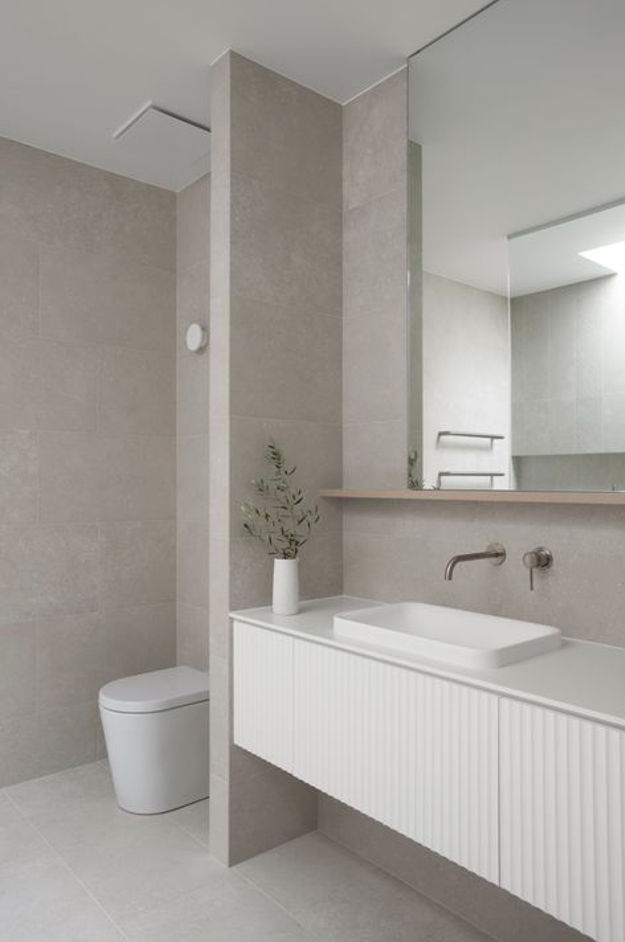
- White: cleanliness, elegance, politeness, simplicity, reliability
How does Color Psychology influence Interior Design?
Based on the Color Psychology studies, each color will result in different human reactions. Therefore, people utilize this concept in Interior Design since they acknowledge the importance of the harmony between colors in creating the most comfortable and relaxing environment.
The following list indicates the top 10 colors which are most used in Interior Design and their influences on human psychology.
Red
Red is a fascinating color that describes emotions in the most complete way. It is usually associated with strong emotions, regardless of the density or the meanings. Therefore, it is vibrant and lively to use this color as a theme in a room.
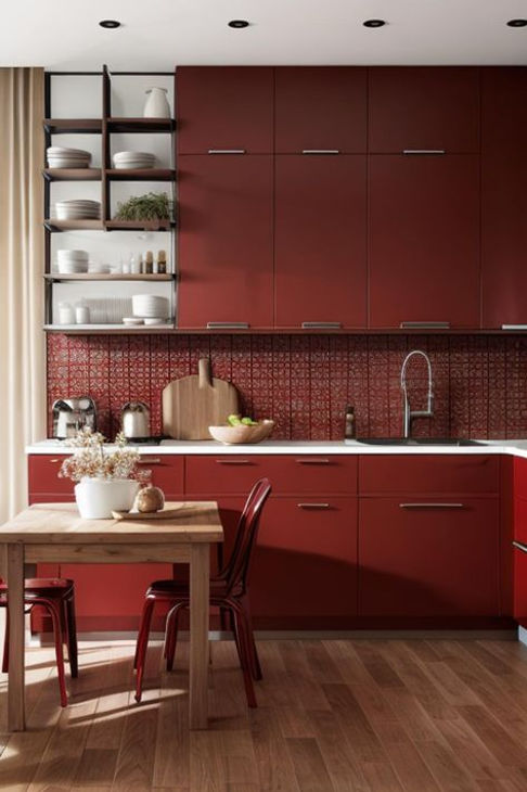
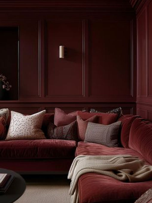
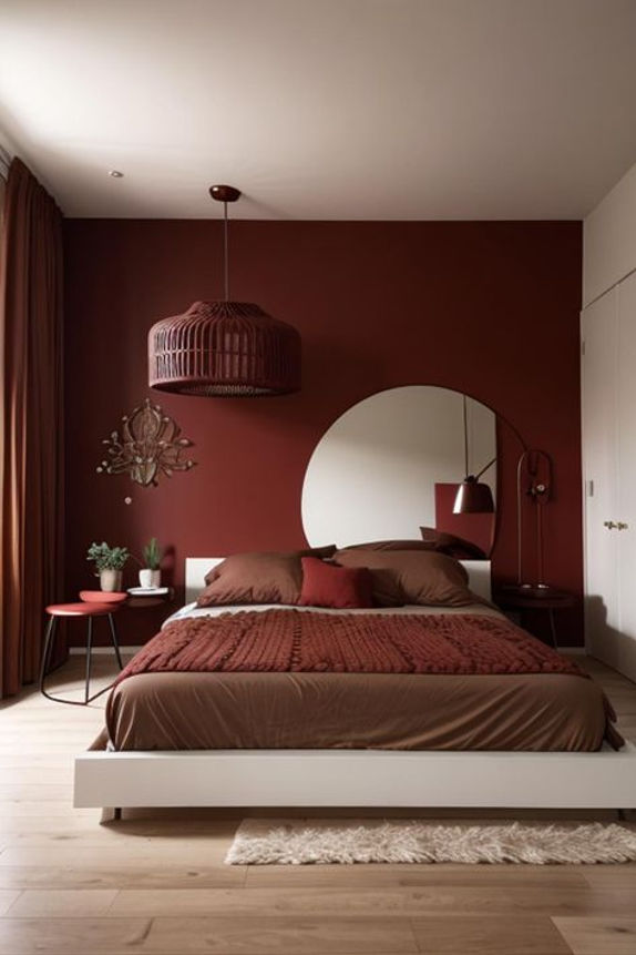
Red can be utilized in a variety of environments: from office to living room, bedroom and even kitchen! In the office environment, red in all shades is a sign of inspiration and enthusiasm – which can boost up energy and productivity at work. When it comes to the living room, the high energy level of this color brings stimulating conversation and bonding relationships. As for kitchen, because of the strong emotions of red, lots of restaurants use it as a theme to attract attention and stimulate human appetite.
Nonetheless, it is highly recommended to use red in the bedroom since it will stimulate emotions in relationships and passion.
Orange
Orange and its all shade often have the positive influences on human emotions and perceptions in many ways. Like red, orange stimulates the strong senses as well as inspires passion and appetite. his color also provides oxygen for human brain to generate the source of energy.
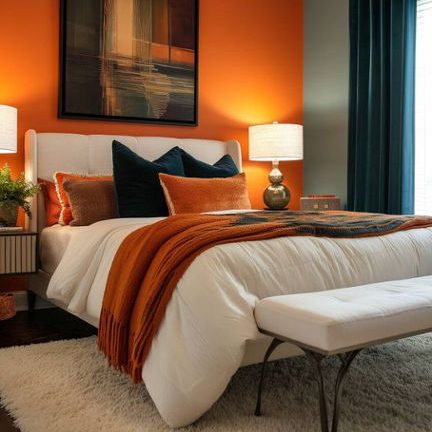
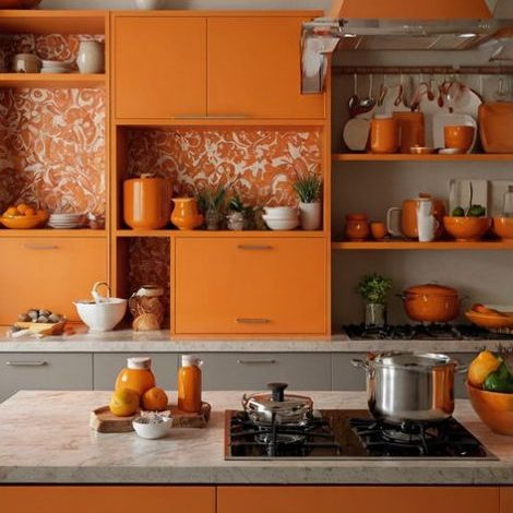
It is optimal to use orange in the bedroom, the gym is also an ideal place to use this color because it brings energy and motivation to people. Another option for using orange is the kitchen since orange can increase the appetite of diners – that is a reason why some famous restaurants use orange as a theme color for their business.
However, it is noticeable that overusing orange may lead to overwhelming feelings and even tiredness. For that reason, it is important to balance the density, choose the appropriate shades and combine with other colors to bring the best effect.
Yellow
Yellow can be seen as a sun, which indicates happiness and shining. This color also demonstrates well-being and encourages.
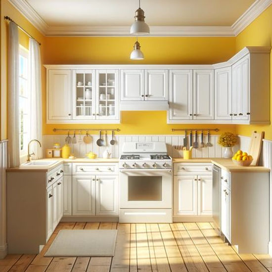
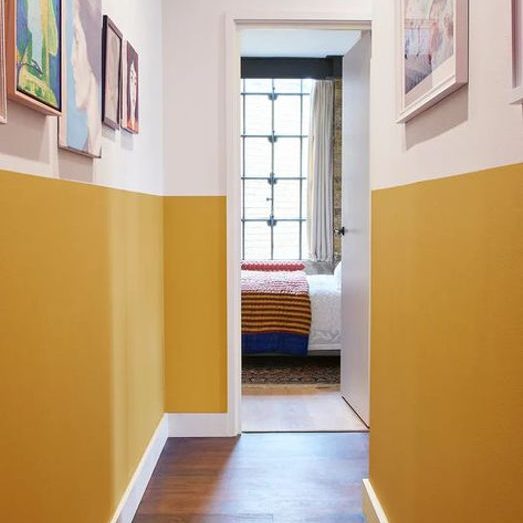
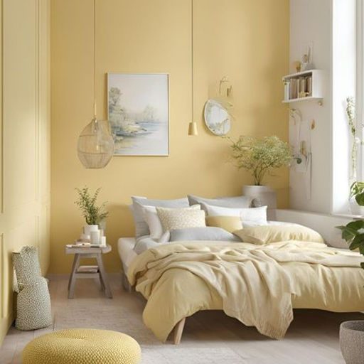
In Interior Color Psychology, it is infrequent to use solely yellow in a room because yellow tends to stimulate the feelings uncontrollably . Instead, people will combine it with other colors in order to ensure the room’s balance and harmony. Besides, it is also remarkable that the dark yellow may bring negative effects on human perception such as sadness or illness.
It is recommended to use yellow in the kitchen area, hall and bedroom because the shining effect of this color will bring warm and bright feelings to the covered areas.
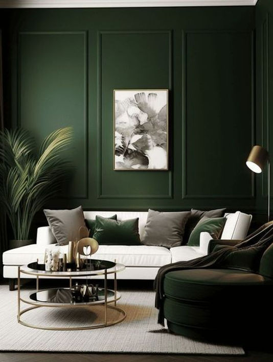
Green
When it comes to green, people have a tendency to reminisce about nature and freshness. In fact, green is the most calming and relaxing to the human eye. It is also a flexible color illustrating different expressions when using different shades. For example: light green indicates freshness and healing while dark green demonstrates the stability and strength. Especially, green has a positive influence on human heart. As a result, green is an ideal color to use in interior design.
As aforementioned, green is a flexible color conveying a variety of meanings. Therefore, you can use this color for all rooms in the house in order to remind of nature and vitality.
Blue
Blue is the color of the sky and beaches. For this reason, blue usually indicates calmness, peace and relaxation. In Interior Color Psychology, blue has a positive impact on human mind in many ways, such as regulating nerves or reducing insomnia.
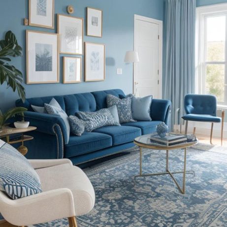
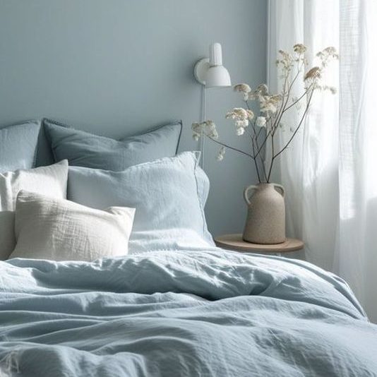
Blue can be used in all rooms of the house with different shades. For instance, dark blue will bring the formal and stylish feelings to the living room while light blue may express the relaxation and tranquil atmosphere of the bedroom.
In order to avoid the coolness because of overusing blue, especially in the narrow area, you should combine blue with warm colors to harmonize the effects.
Pink
Speaking of pink, the first thing that springs to people’s minds is love and femininity. It is supposed that pink may have some impacts on calming and reducing indignation when it is used properly.
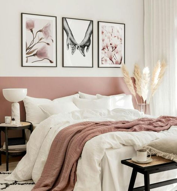
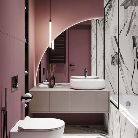
Although pink regularly indicates femininity, it is not synonymous that pink can not be used for men. In practice, pink shade can create a masculine effect and take aesthetics to a new level by choosing simple patterns and sophisticated styles of furniture. Furthermore, pink shade can be used for wall so as to increase the happiness and joy.
The teen girl’s room is the most suitable area for this option. It is also reasonable to use this color in living room and bathroom to bring the warm effects.
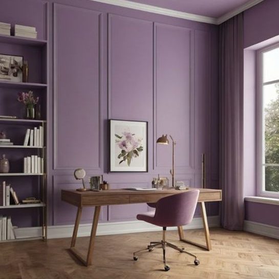
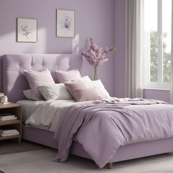
Purple
Royalty, mystery and mature are the first thoughts when it comes to this color. Moreover, It is believed that purple can be used effectively in inspirational fields such as interior design, fashion and graphic design.
In interior design, purple can maximize its inspirational use in artistic workplaces and studios. It is also reasonable to use this color in the dressing room and bedroom.
Because purple symbolizes elegance and luxury, it is highly recommended to use this color in the front hall or the living room – areas that guests usually spend time staying in.
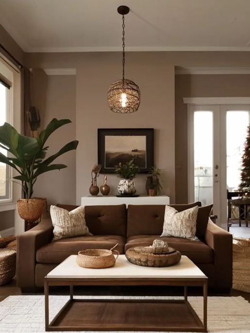
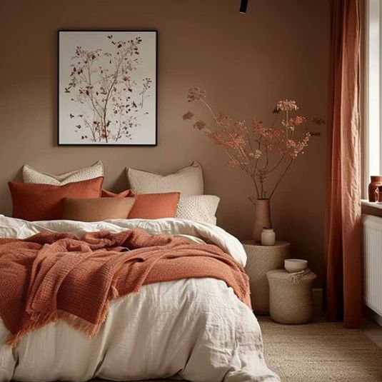
Brown
Unlike those aforementioned colors, brown tends to be gloomy and somewhat monotonous. Indeed, brown often indicates simplicity, warmth and trust. Therefore, it must be careful to use this color to avoid creating a feeling of sadness or discomfort due to overuse of brown.
People can use brown for all rooms because of its high applicability. However, we should combine this shade with colors having happy meanings, such as red, yellow, white. This will help to harmonize the atmosphere of the room.
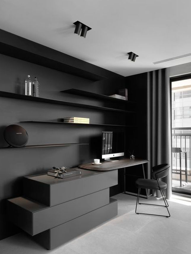
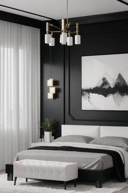
Black
Black is a highly appreciated color for its simplicity, versatility and elegance. According to the Interior Color Psychology, a room covered in black may bring the feelings of sorrow and murky. Nonetheless, the room will have an amazing effect if people know how to balance black and other colors.
Black is an awesome color in interior design, it will enhance not only the gentility but also the luxuriousness of the room. This color is suitable for the current minimalist living trend.
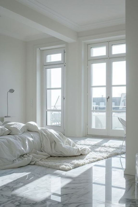
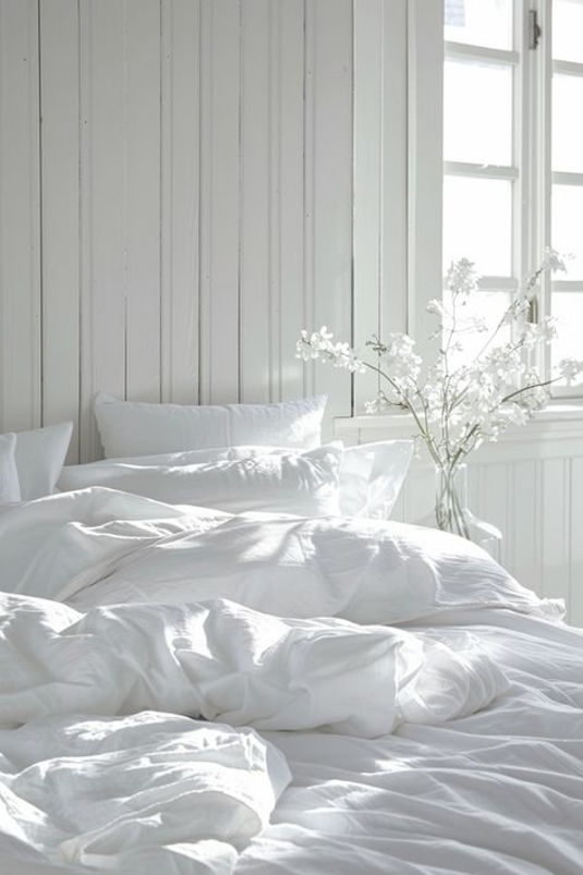
White
In interior design, white is a neutral color and plays a vital role in color matching. In Interior Color Psychology, white can widen the area – which is beneficial for people having Claustrophobia. Besides, white indicates cleanliness and tranquility. Therefore, people tends to feel less stressed in a white room.
Because of its versatility, you can use white for every corner of your house – even combine it with either cold or warm colors to bring the most vivid effects.
Conclusion
We have just been through the Interior Color Psychology concept and its application in interior design. The Sunday Snug hopes this article will be useful for you to enhance the aesthetics of your rooms by choosing the right color palette.
Related topics
Tips for Creating a Cozy and Minimalistic Home
7 Scandinavian Design Furniture Pieces We Love
Discovering Maximalist Interior Design: An Expression of Luxury
